Client: De Morgen
The concept
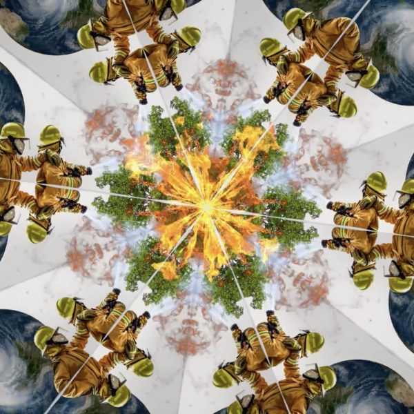
Every year, De Morgen – a leading Belgian newspaper – releases an overview of the most important articles they published throughout the year. This year we decided to create an online experience that gives visitors an interactive overview fit for 2020: the most chaotic year of our lives.
We launched a responsive website with 12 interactive kaleidoscopic scenes. One for each month, built with elements representing the most important news items for that month. The user can interact and play around with the kaleidoscopes as well as discover the news articles that are related to every element in the kaleidoscope.
English version: https://2020-dm.com
Dutch version: https://2020.demorgen.be
Favourite Website Awards
On January 13 our website was awarded with FOTD - FWA of the day. Every day, the FWA jury selects the best project. FWA awards cutting-edge innovation in
digital design and development.
Visit the case here: https://thefwa.com/cases/the-e...
Mobile Excellence
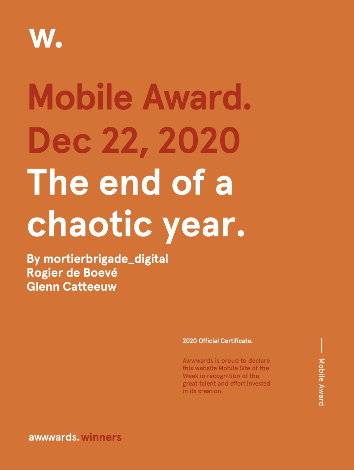
The world famous Awwwards named our site “Mobile of The Week”. The Mobile Excellence Award celebrates work that puts users first, whilst bridging great design with pure performance. It recognises hard work and aims to raise the standards of the mobile web.
You can read the full report here: https://www.awwwards.com/sites/the-end-of-a-chaotic-year/mobile-excellence-report
CSS Design Awards
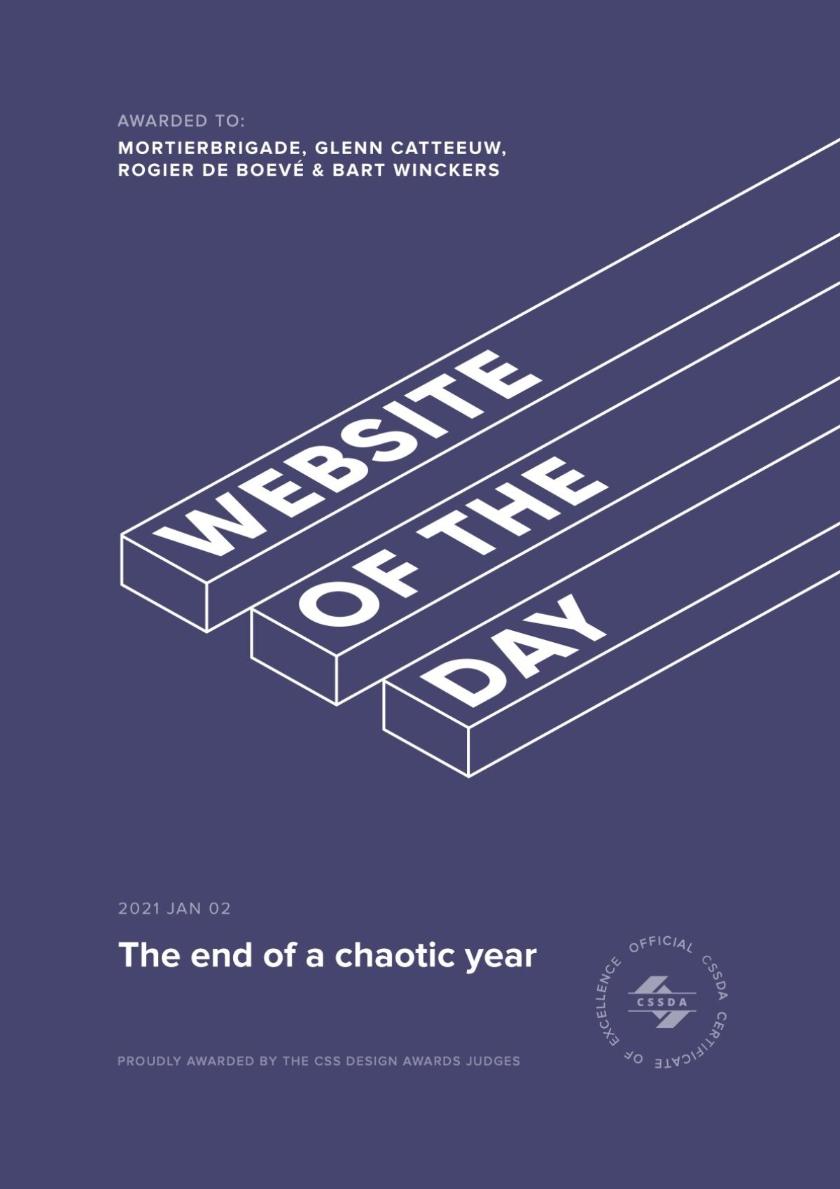
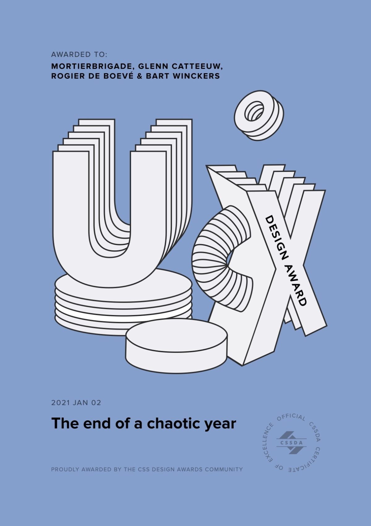
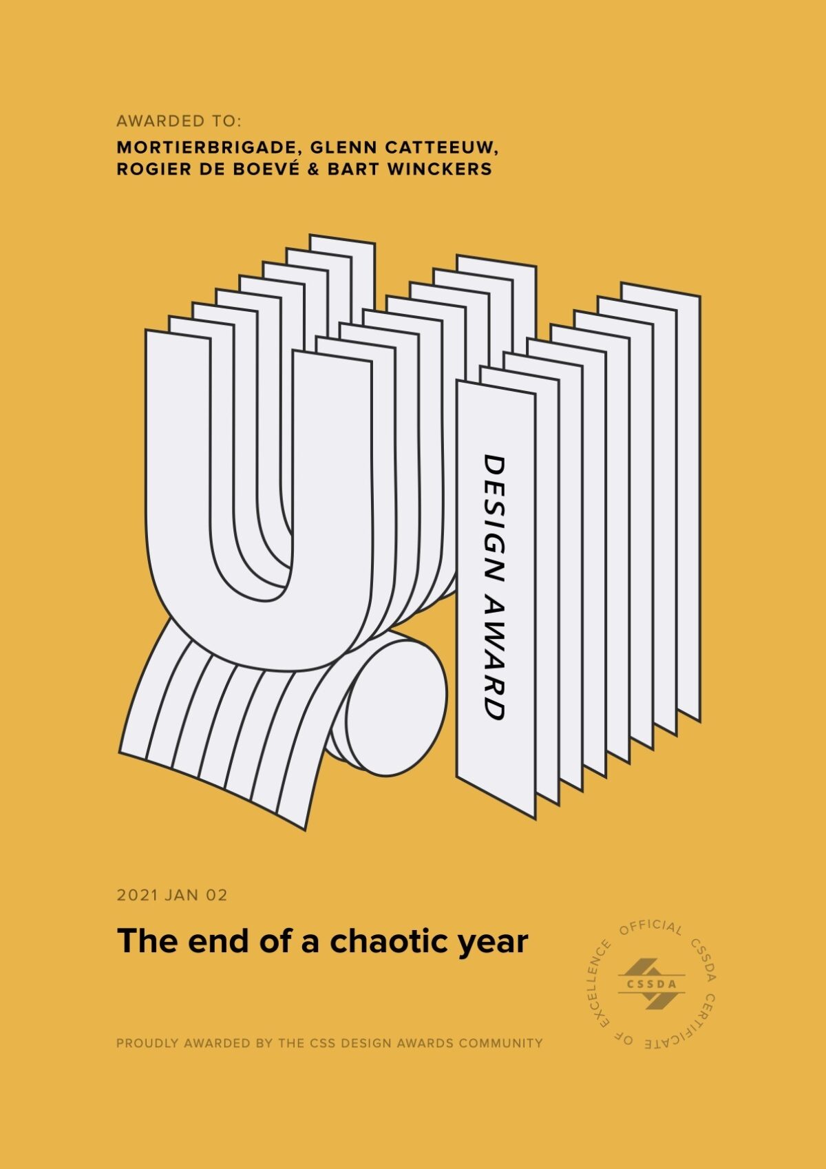
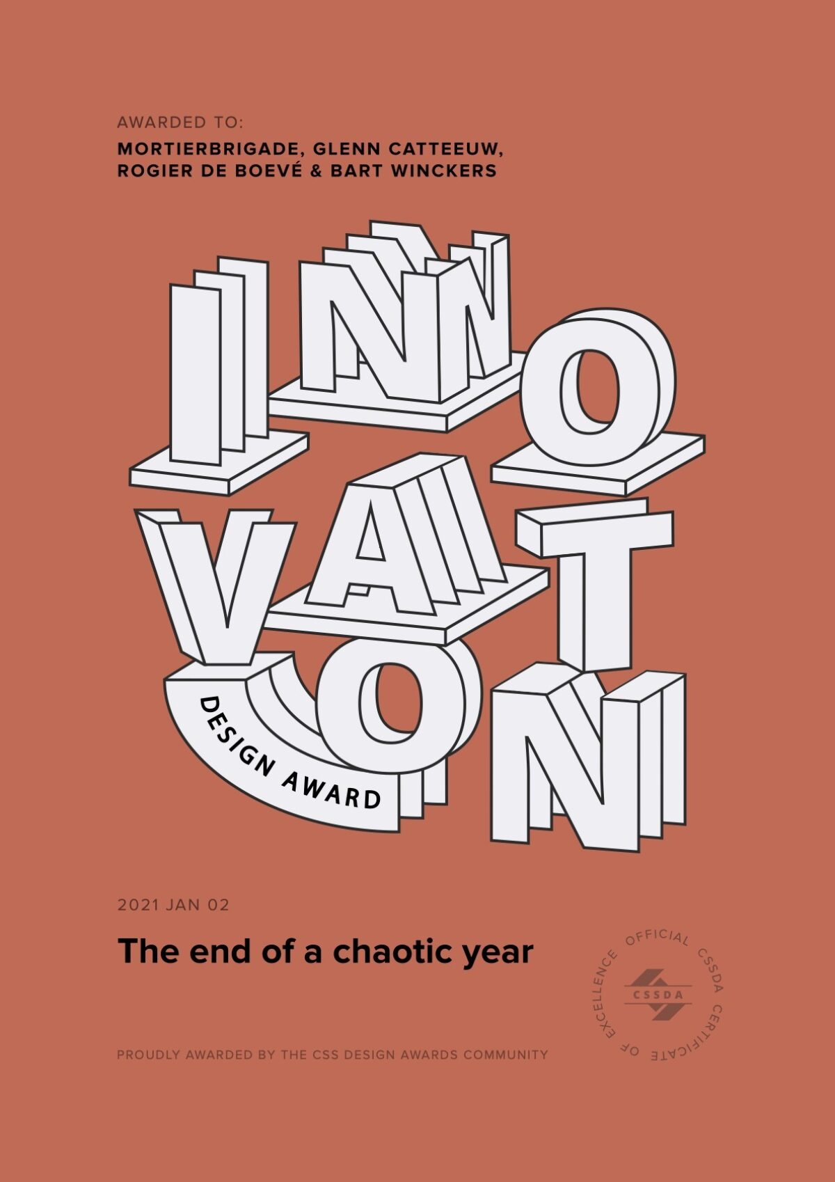
Our website has been rewarded by the CSS Design Awards team with:
- Website Of The Day Award
- Best UI Design
- Best UX Design
- Best Innovation
Technology
The website was built with a Vanilla JS structure combined with WebGL (ThreeJS) for the kaleidoscopes. The general animations and page transitions were built with GSAP & Highway JS.
 All Projects
